Hover Animations — Interactive Cursor Effects
Hover animations play whenever a laptop or desktop visitor places their mouse cursor over an item! Adding slightly bouncy hover animations to things like buttons and cards feels incredibly satisfying to click.
A website shouldn’t just look good — it should respond.
That’s where hover animations come in.
When a user moves their cursor over a button, card, or element, a subtle animation gives instant feedback. It makes the experience feel interactive, responsive, and satisfying.
With Levo, adding hover animations is quick, flexible, and powerful — no code required.
What Are Hover Animations?
Hover animations are triggered when a user places their cursor over an element.
Unlike other animations, they don’t wait for page load or scroll —
they respond instantly to user interaction.
This makes your UI feel alive and intuitive.
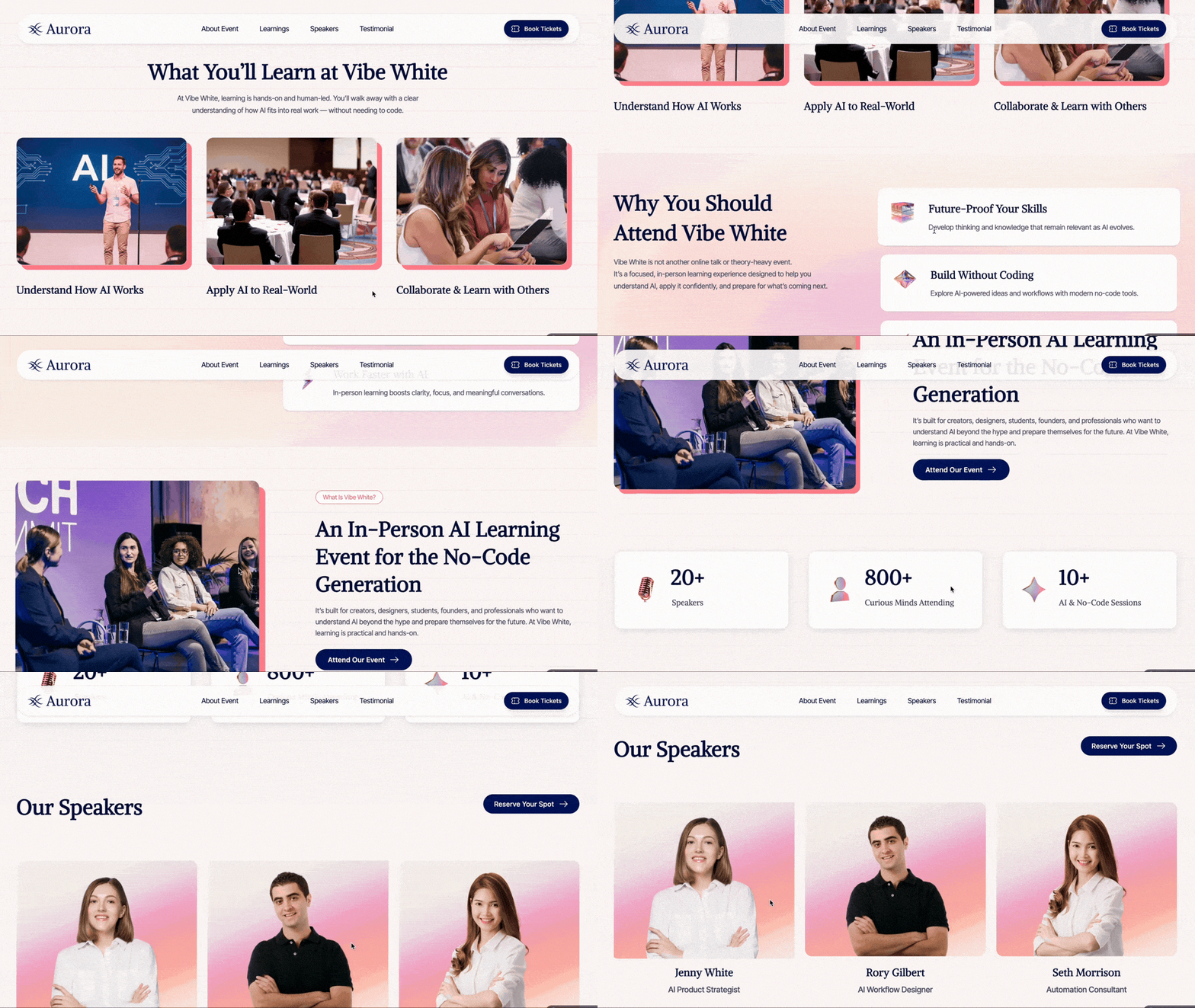
How to Add a Hover Animation?
Adding a hover animation in Levo is simple:
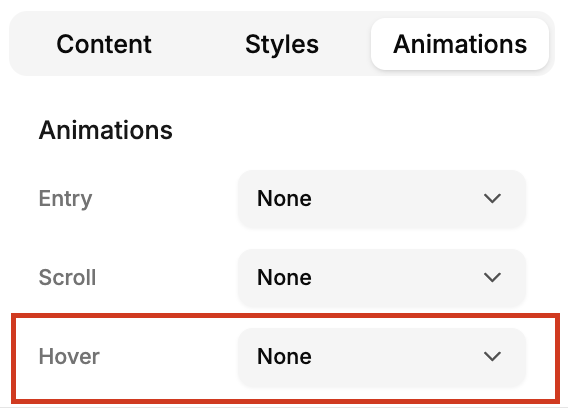
Click on the element you want to interact with
Open the Animation tab
Go to the Hover section
Choose a preset or customize your animation
That’s it — your element is now interactive.
Hover Animation Presets
Levo provides a variety of presets to quickly add interaction.
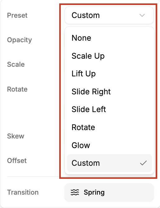
Here are the most commonly used ones:
1. Scale Up:
The element slightly grows, creating a “coming forward” effect.
Best for: buttons, CTAs
2. Lift Up:
The element gently moves upward.
Best for: cards, product tiles
3. Slide Left / Right:
The element shifts horizontally to left or right.
Best for: creative layouts, directional cues
4. Rotate:
Adds a subtle spinning effect.
Best for: icons, playful elements
5. Glow:
Creates a soft glowing highlight.
Best for: premium buttons, highlights
6. Custom:
Gives you full control to create your own hover effect.
Customizing Hover Animations
Hover animations in Levo are designed to be simple and intuitive.
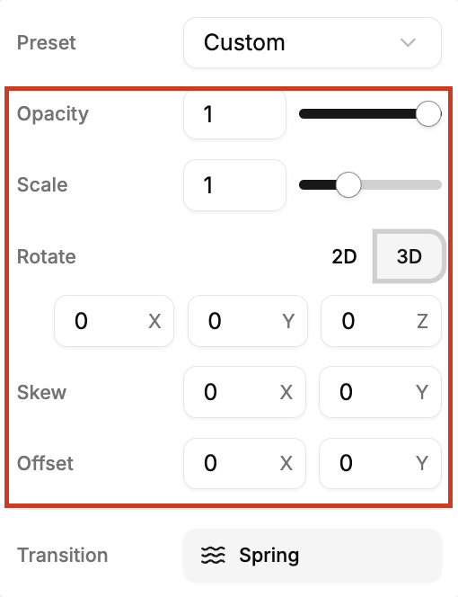
You can adjust properties like:
Opacity → makes the element slightly transparent
Scale → makes enlarge or shrink the element
Position (X/Y) → move the element on X,Y,Z axis
Rotate → add subtle motion and spin.
You’ll also find advanced options like:
Skew
Offset
 These are especially useful for cards and interactive components.
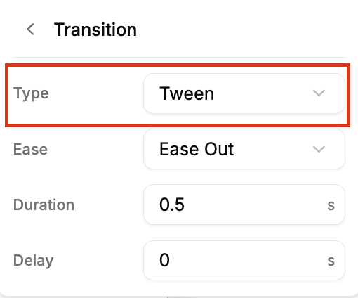
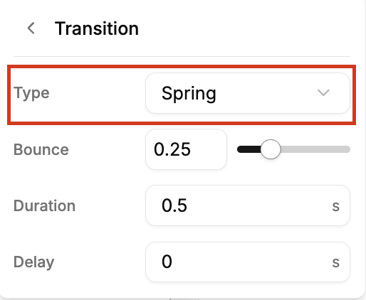
Transition Types
Just like entry animations, hover animations support two transition styles:
Tween
Smooth, predefined motion
Simple and consistent
Spring
More natural and fluid
Feels more modern and dynamic
Where to use Hover Animations?
Hover animations are most effective when applied to interactive elements.
Here are some great use cases:
1. Buttons & CTAs:
Add subtle scale or glow to make them feel clickable.
2. Cards & Components:
Use lift or scale effects to create depth and hierarchy.
3. Product Listings:
Highlight products with hover interactions to improve engagement.
4. Navigation Items:
Add small motion to indicate interactivity.
5. Icons & Micro Elements:
Use rotate or subtle movement for a playful touch.
Best Practices
To get the best results:
Keep hover effects quick and responsive
Avoid exaggerated or distracting motion
Maintain consistency across similar elements
Use hover only where interaction is expected
Always test on different screen sizes
Hover animations should feel natural — not forced.
Hover animations are small, but they make a big difference.
They turn static elements into interactive experiences — making your website feel more engaging and intuitive.
With Levo, you can:
instantly add interactivity
customize motion easily
create a polished user experience
— all with just a few clicks.
Sometimes, it’s the smallest interaction that users remember the most.